
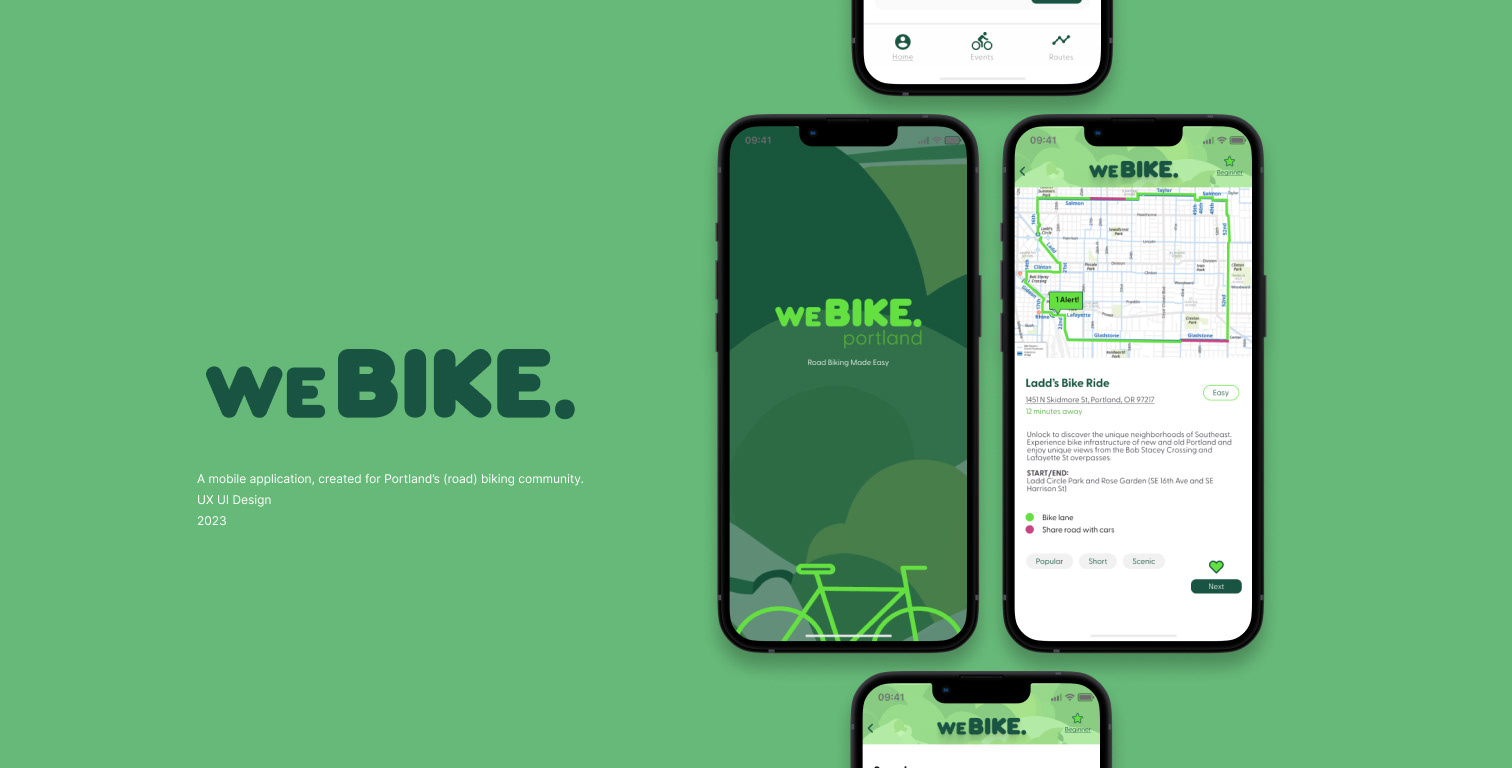
weBike., End to End Application
Brand and website development for a hypothetical product,
created for Portland's road-biking community.
My Role:
Research, Personas, Task Flows, Sketching, Wire-framing, Visual Design/Branding, Prototyping, User Testing
Team:
Group Critique Peers
created for Portland's road-biking community.
My Role:
Research, Personas, Task Flows, Sketching, Wire-framing, Visual Design/Branding, Prototyping, User Testing
Team:
Group Critique Peers
Product Preview
About
About weBIKE.
Portland is a very bike-forward space, though the thought of commuting on the road with other cars can be challenging for someone who has never used their bike this way. weBIKE. started as a way to elevate the bike riding experience for anyone using their bike on the streets in Portland, though also expanded to meet the needs users had of meeting other bikers in the area.
The Challenge
Though Portland has an already established biking community, it can be difficult for beginners to access the knowledge kept in these spaces and for many, it can be intimidating. weBIKE. set out to create a safe and comfortable space for people, no matter their biking experience.
Objectives
Resources and community encompass the main objectives of weBIKE., though there is also a focus on helpful navigation and event-finding tools.

Research
Initial Thoughts:
When I moved to Portland, I had never took a bike onto the street, let alone used it for commuting.
I wondered if anyone else had experienced the fear and anxiety that I had when I bought my first vintage, team-fuji bicycle.
(Gold trim, vintage gear-shift. It was cute, that's all I really cared about.)
(Gold trim, vintage gear-shift. It was cute, that's all I really cared about.)
I pumped the tires and realized my hands were sweaty.
There were so many questions.

Research
I decided to do a competitive analysis to see what were other people using to elevate their road biking experience?
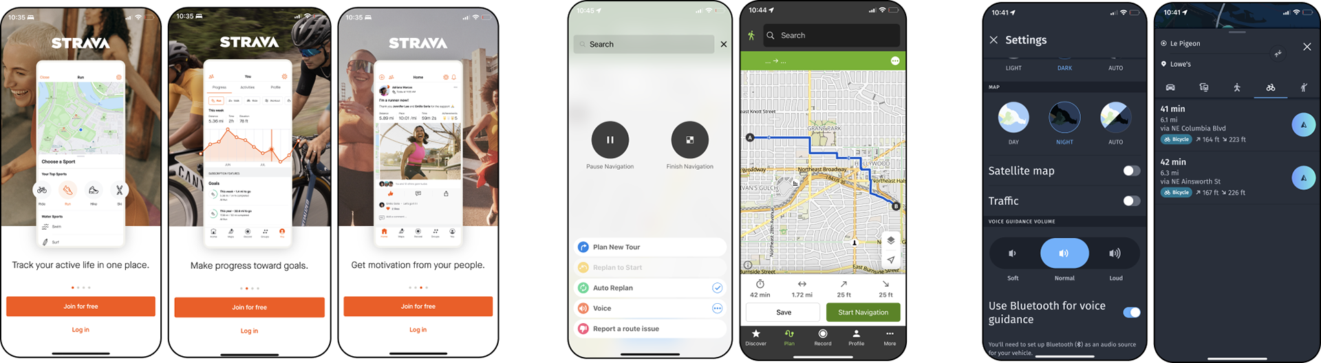
I did a quick survey and found that many people were using Strava to connect with other biker's.
Some other products on the market included Komoot, Here weGo and even Google Maps.
Some other products on the market included Komoot, Here weGo and even Google Maps.
While they had great interfaces for their route navigation, their features sort of ended there.

POV / HMW
Biking in Portland can be fun and is a great alternative to typical forms of transportation.
With it’s bike-friendly streets, many opt in to using their bikes for transportation. It’s also a great way to connect to the community. Through user interviews, it was clear that starting to bike brings challenges, as starting any new skill might.
With it’s bike-friendly streets, many opt in to using their bikes for transportation. It’s also a great way to connect to the community. Through user interviews, it was clear that starting to bike brings challenges, as starting any new skill might.
How might we ease the biking experience for those facing challenges and elevate it for those already comfortable in this setting?
Interviews
I asked street bike users for insight into their motivations and experiences. Five different people spoke about their experiences.
Some comments that stood out to me and that helped guide the next steps:
"My plan is to take rides after work, for exercise. for my brain. I just don’t really know where I should be riding, where I should go on my own. I think I'm just gonna start riding. but that feels nerve-racking?
"I do attend events in the summer time, when biking in Portland is in full swing. It feels rewarding when I do it and it’s good exercise."
"I have seen someone pop their tire and that really scares me. Do I just fix it there? What do I do? What if it's dark? These things keep me up at night."
After interviews, I realized that people had questions and no matter what level of experience, they were always interested in learning more.
User Persona
Meet Andrew.
Andrew identifies as being introverted but is interested in meeting new people. His move to Portland feels like his chance to start new, to start fresh. Andrew wants to meet new people that share similar values and he feels that he can find that in the biking community.
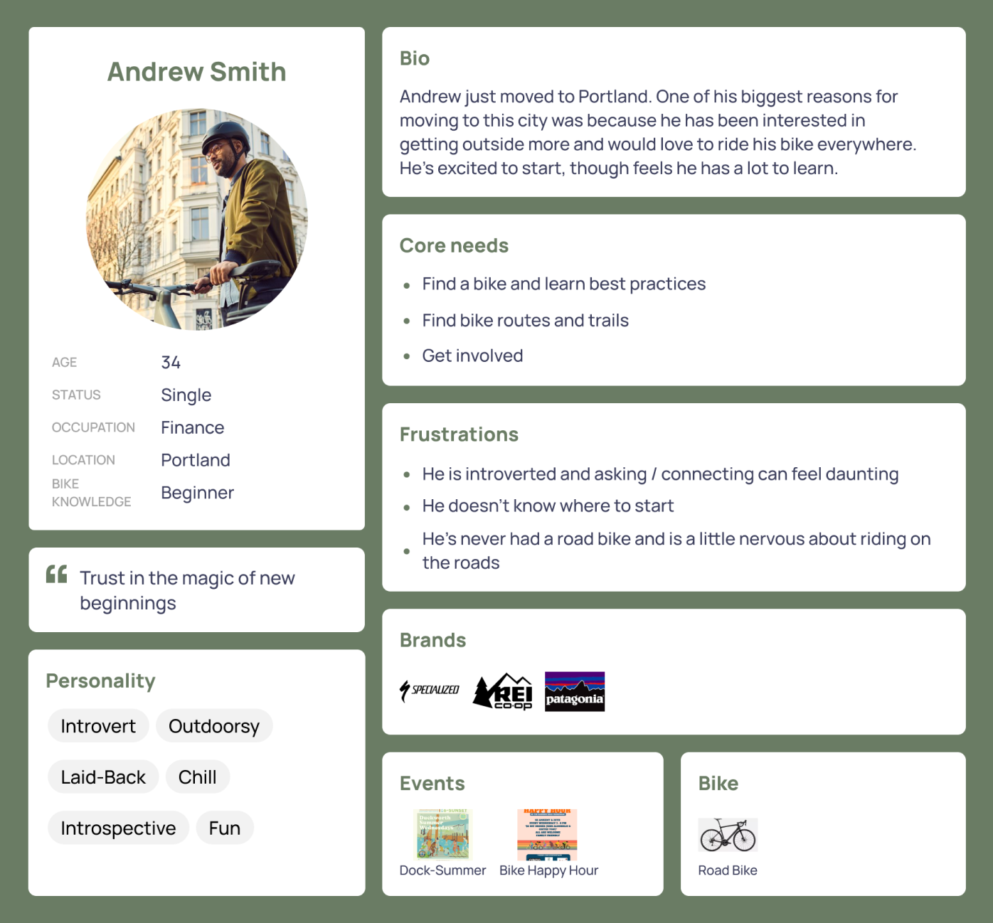
How can we get Andrew involved and help him learn to ride his bike safely, comfortably?

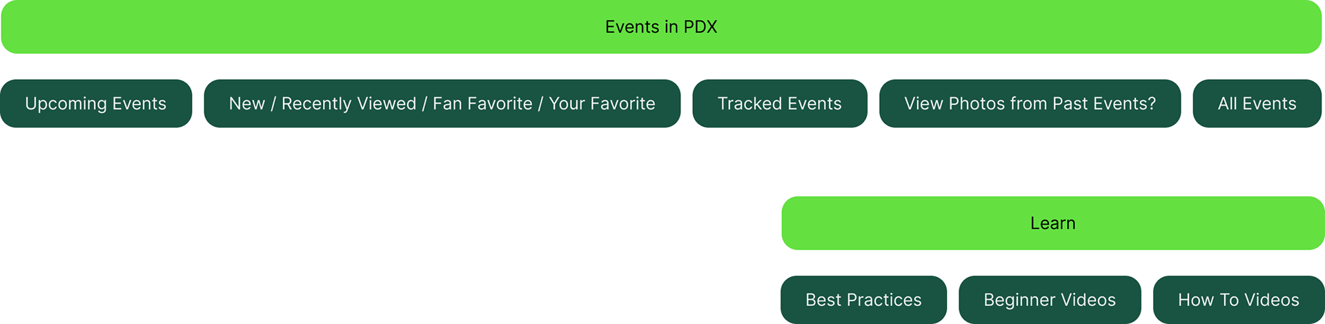
Road Map
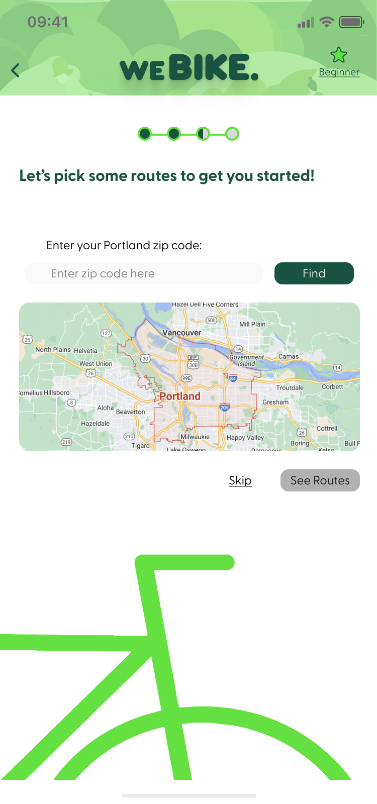
I used a road map to organize the features I thought would be helpful, based on my interviews with users.
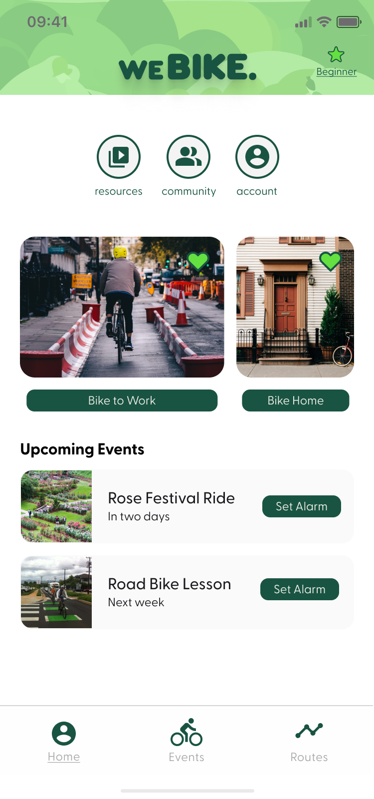
Users wanted to see events in one place. I included things like "Upcoming Events," and "Tracked Events" into the "Event" space. Learn was a valuable feature, which would include things like "Best Practices," and "How-To Videos."
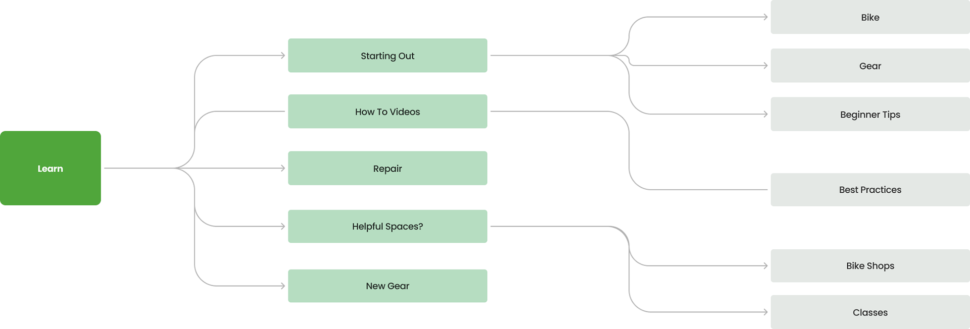
Site Map
I wanted to map the user's journey through weBIKE.
I created a site map to visualize the process. I used the "Learn" tab to sort out important resources I wanted to feature.
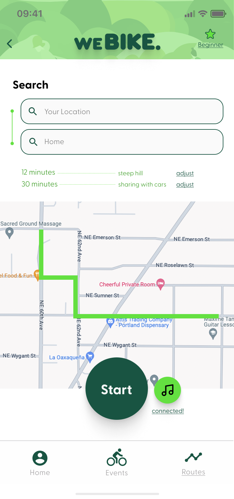
User Flows
I wanted to know how a user would interact with the content I added into weBIKE.
I created a few task flows to understand my product's capabilities and user flows to understand the user.
I wanted the space to be as intuitive as possible so this process helped me map out the journey so the user wasn't taking any unnecessary steps.
I wanted the space to be as intuitive as possible so this process helped me map out the journey so the user wasn't taking any unnecessary steps.
After doing the following flow, I realized that an onboarding process would be helpful, to assist the user when they reach the 'starting out' point.


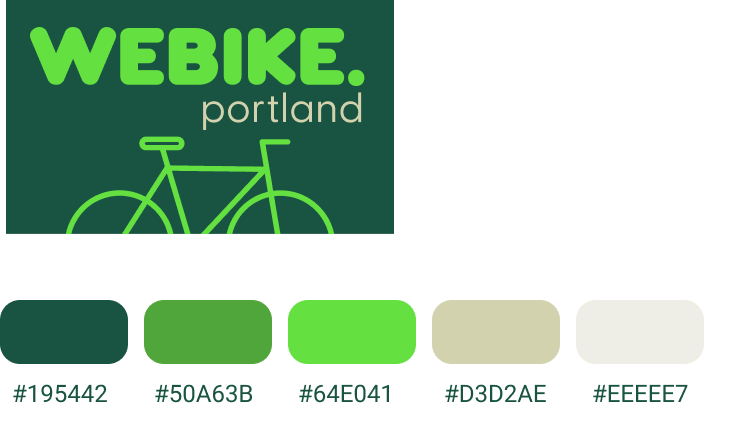
Branding
I knew that I wanted my brand values to mimic those that I've found in Portland: environmentally conscious, friendly, fun. I created a mood board to reflect that.
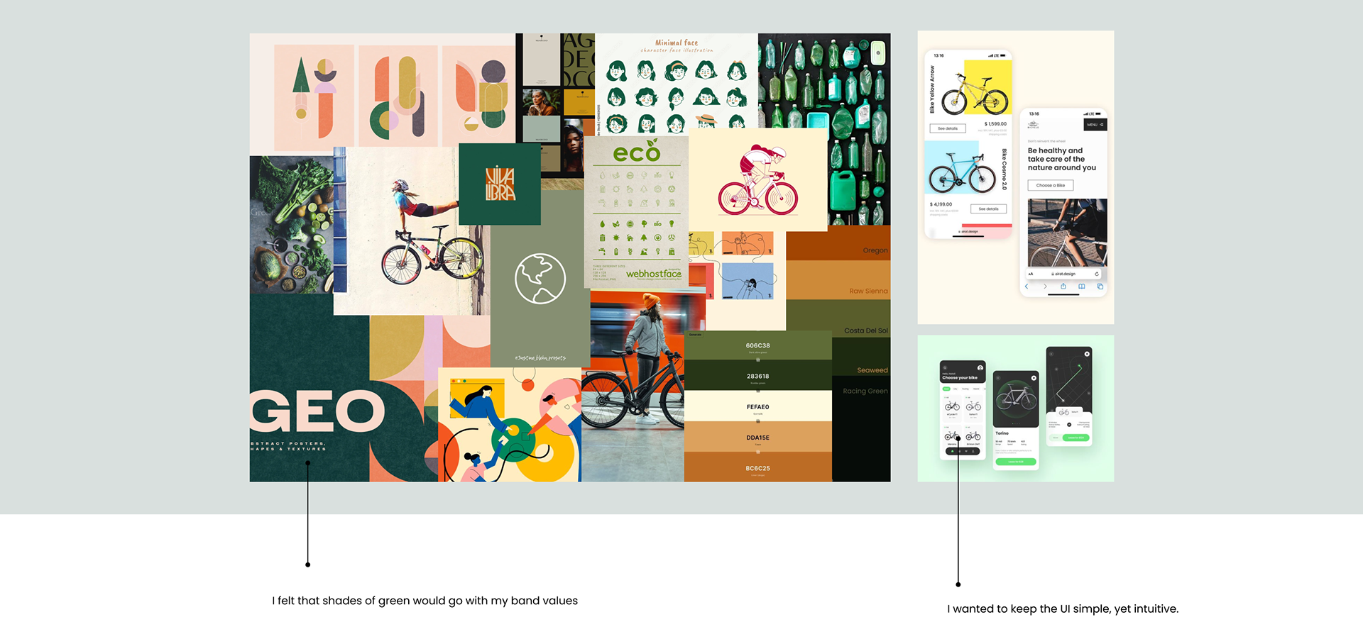
The weBIKE. logo was built.
I created a logo that replicated bike paths found in Portland streets and to reflect my chosen brand values.
The colors helped tie into my values while also replicating bike friendly spaces that already exist in the world.

Iterations
Initial Sketches

I sketched out the first couple of features before jumping into Figma. I wanted to know how I would lay out the home screen, community pages as well as the map.
I thought it would be helpful if there was a space a user could go to, to remind them what events they were interested in and other features they had added to their 'favorites.'
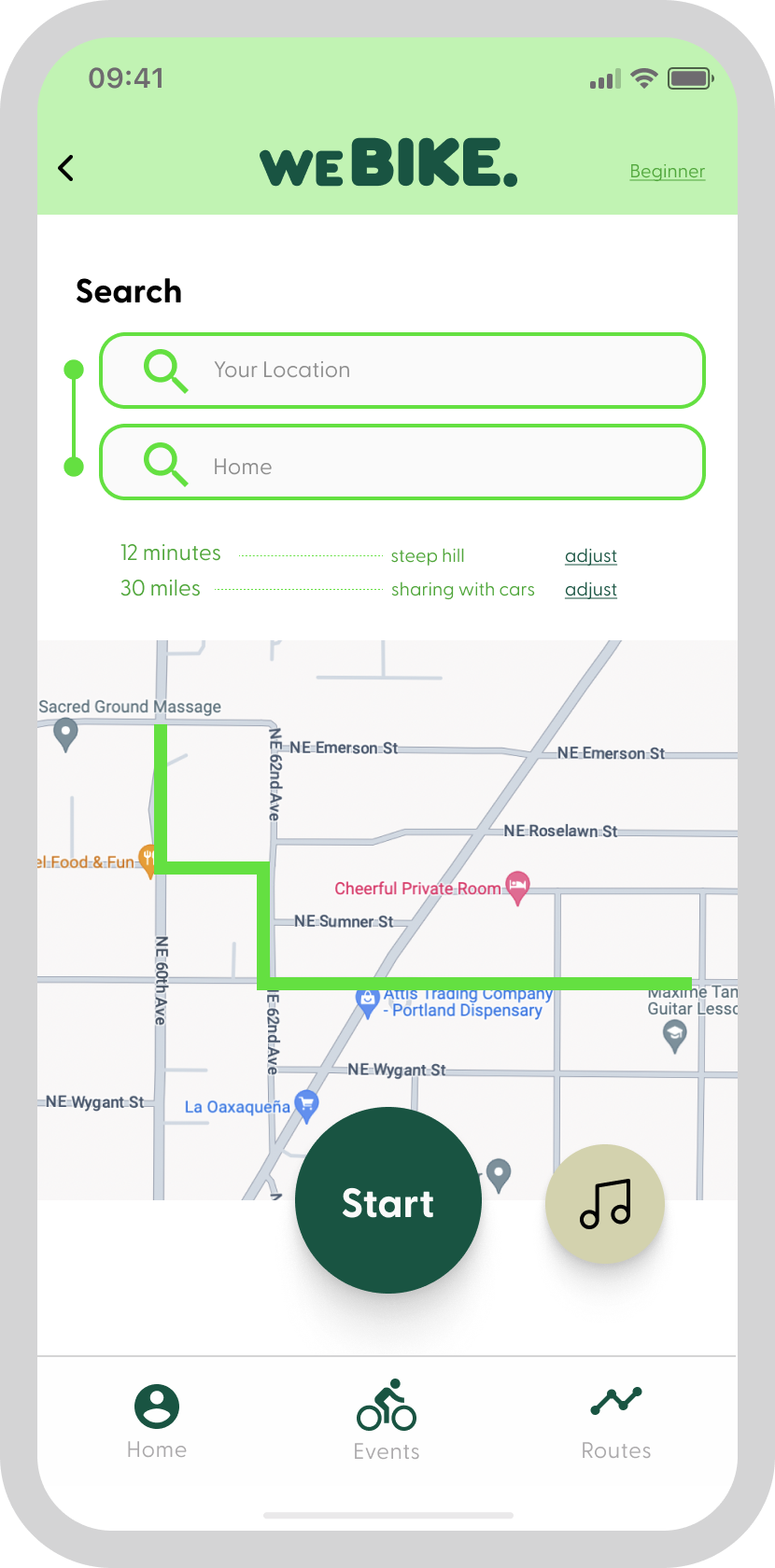
The "track" space would also be crucial and would be catered to assist a biker while they were navigating.
Fidelities
I created a few key screens in Figma, to help lay out my ideas in more depth.

UI
Before I jumped into a higher fidelity of my key frames,
I created UI elements that encapsulated weBIKE. as a whole.
Simple card structures would keep the design clean and outlined elements would add a touch of playfulness.
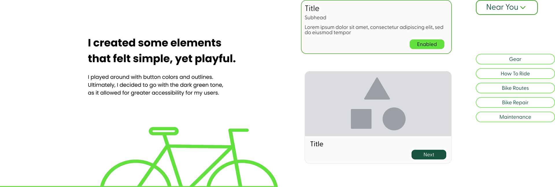
I added the elements throughout my screens, to create cohesion.
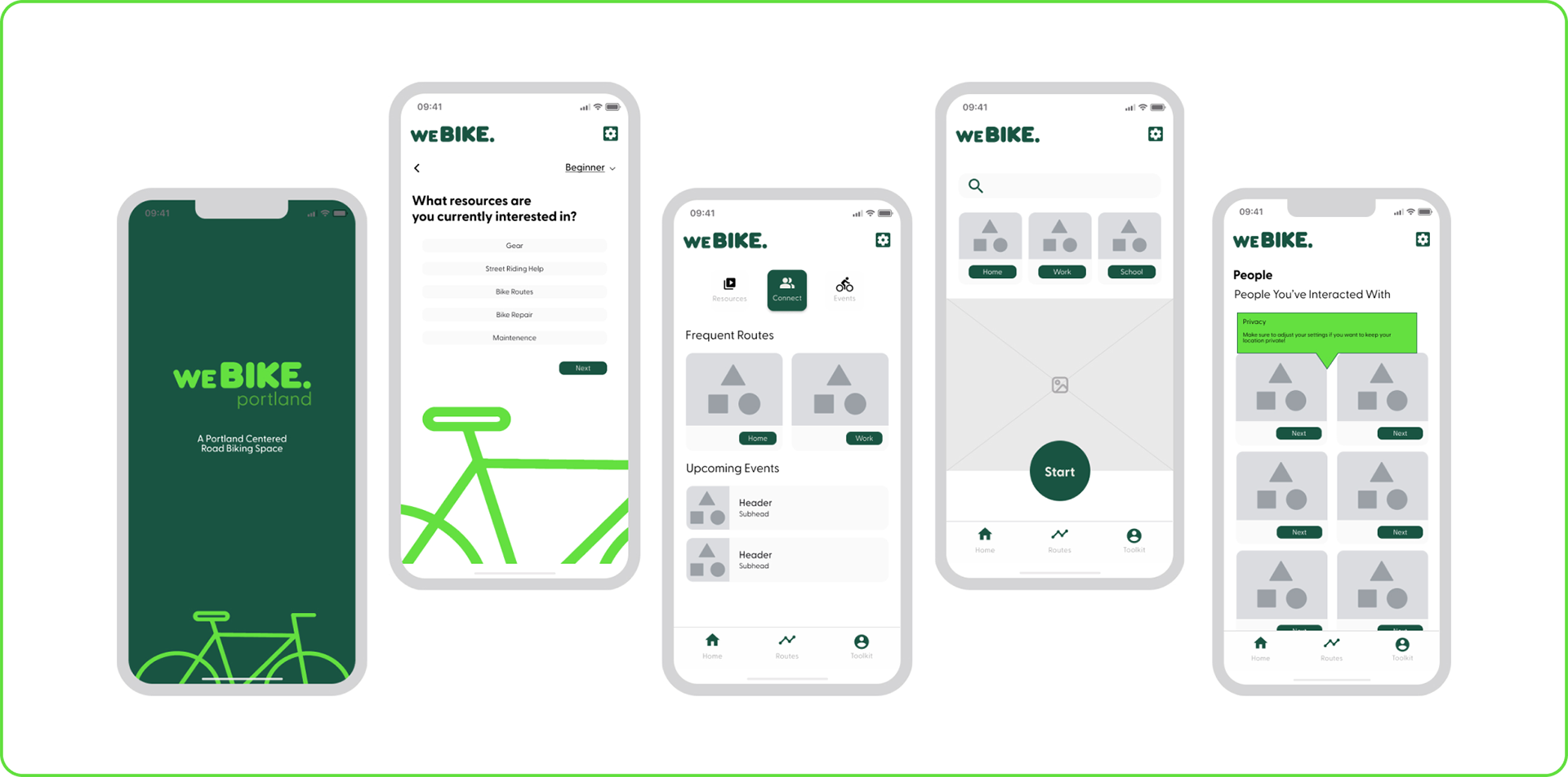
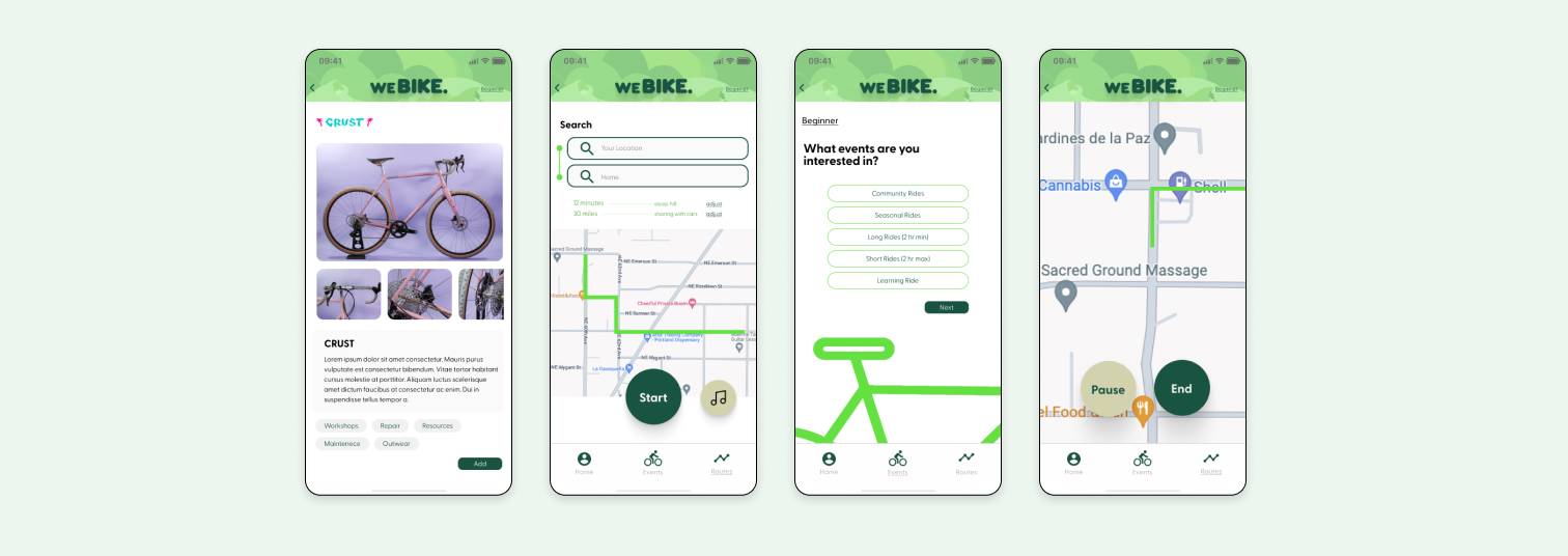
High Fidelities
Using generative AI, I created a pattern that would bring a touch of Portland into the design.
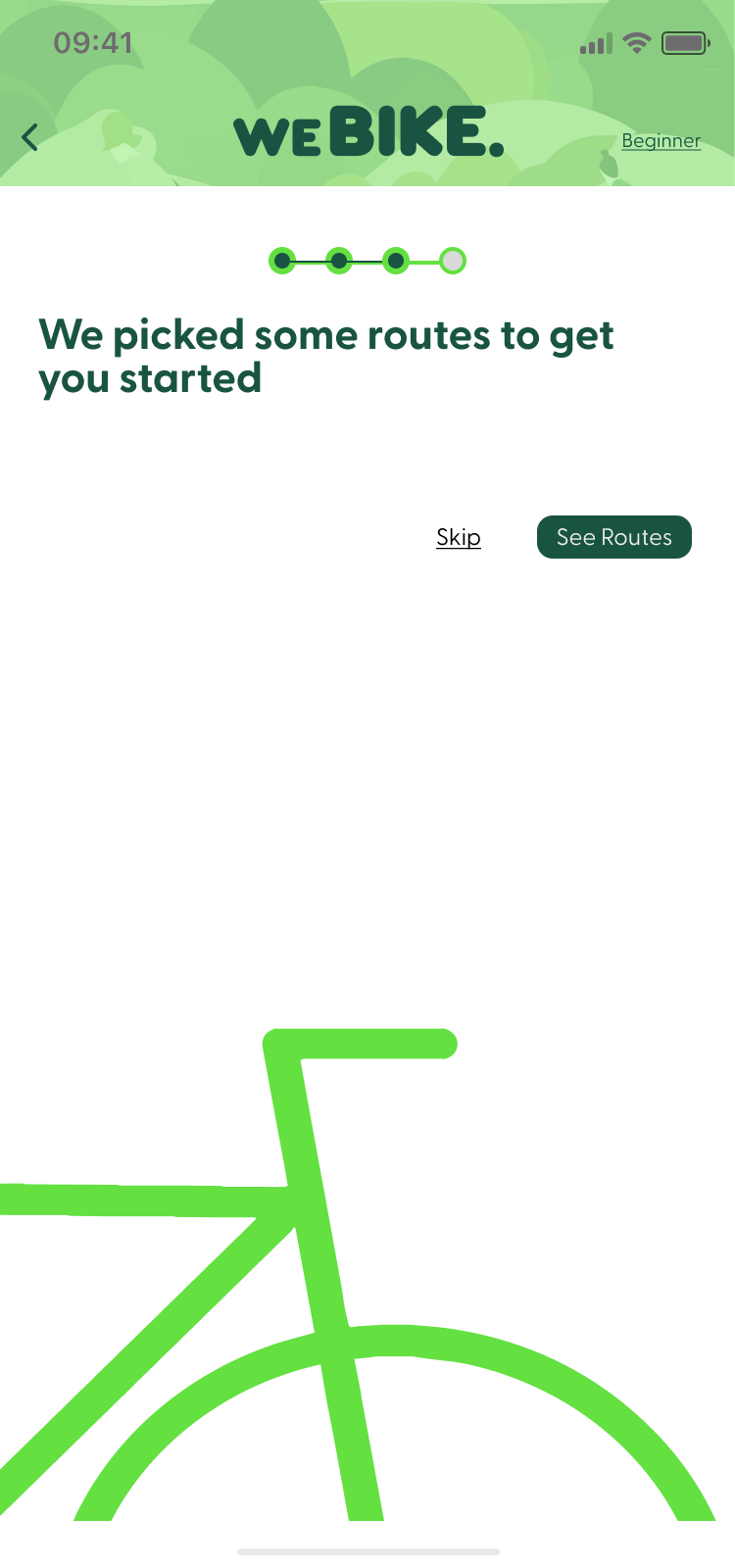
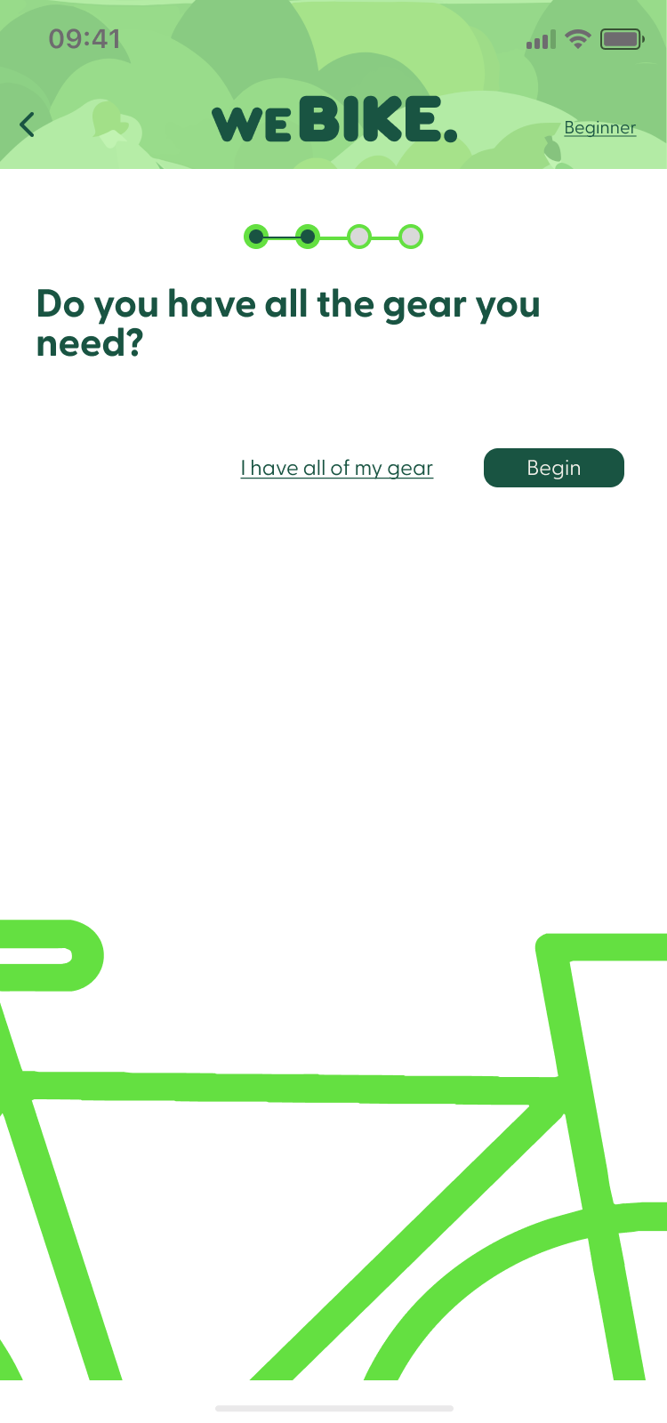
Onboarding.
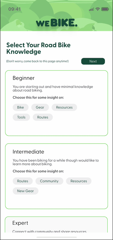
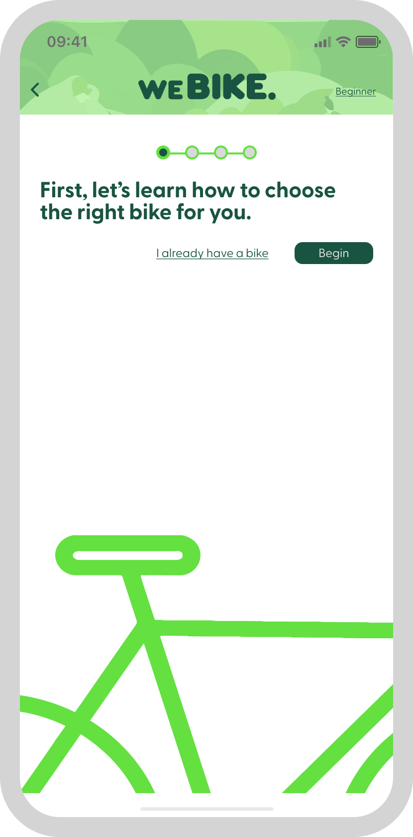
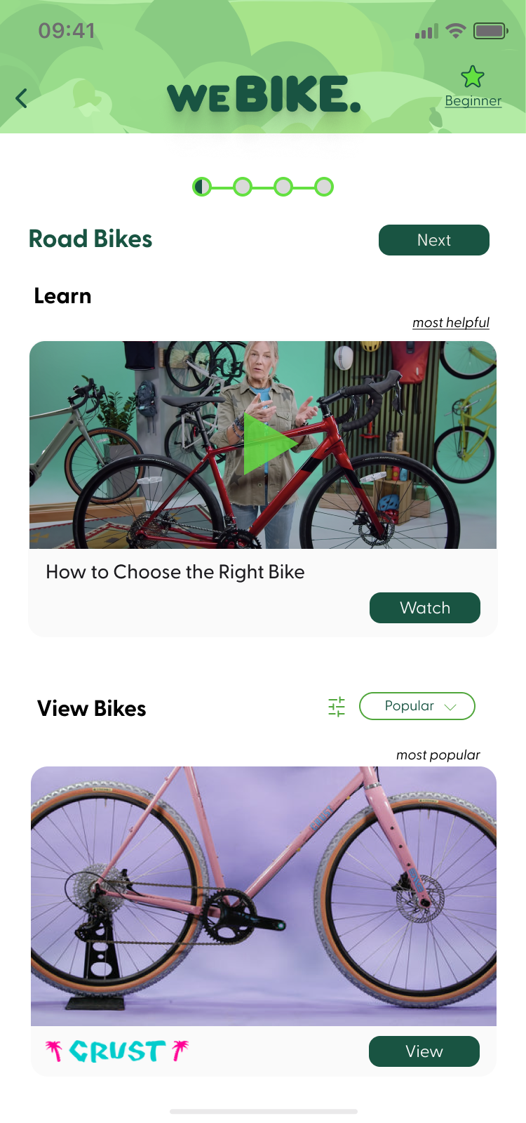
I created an onboarding process for new users - one they can opt out of. I thought this would be a helpful walk-through to help educate them on resources and information needed.
A few more screen close ups.

Usability Testing
After creating a prototype, I conducted a few Usability Tests with folks who identified with either riding a bike in Portland, or using a product to that helped them gain insight and provided resources.
I wanted to test if the onboarding process made sense to users and what their experience was completing it.
My other objectives were to see if the overall look and feel of the app was intuitive and that the intended resources were easy to find.
My other objectives were to see if the overall look and feel of the app was intuitive and that the intended resources were easy to find.
Users found that the onboarding process was confusing.
Josh had more questions after going through the process, "When asked if I need a bike, my though is: I already have a bike but want info about if this is the kind of bike I should be riding on the street."
Josh had more questions after going through the process, "When asked if I need a bike, my though is: I already have a bike but want info about if this is the kind of bike I should be riding on the street."
When asked about gear, he mentioned that he didn't know what kind of gear he was supposed to have.
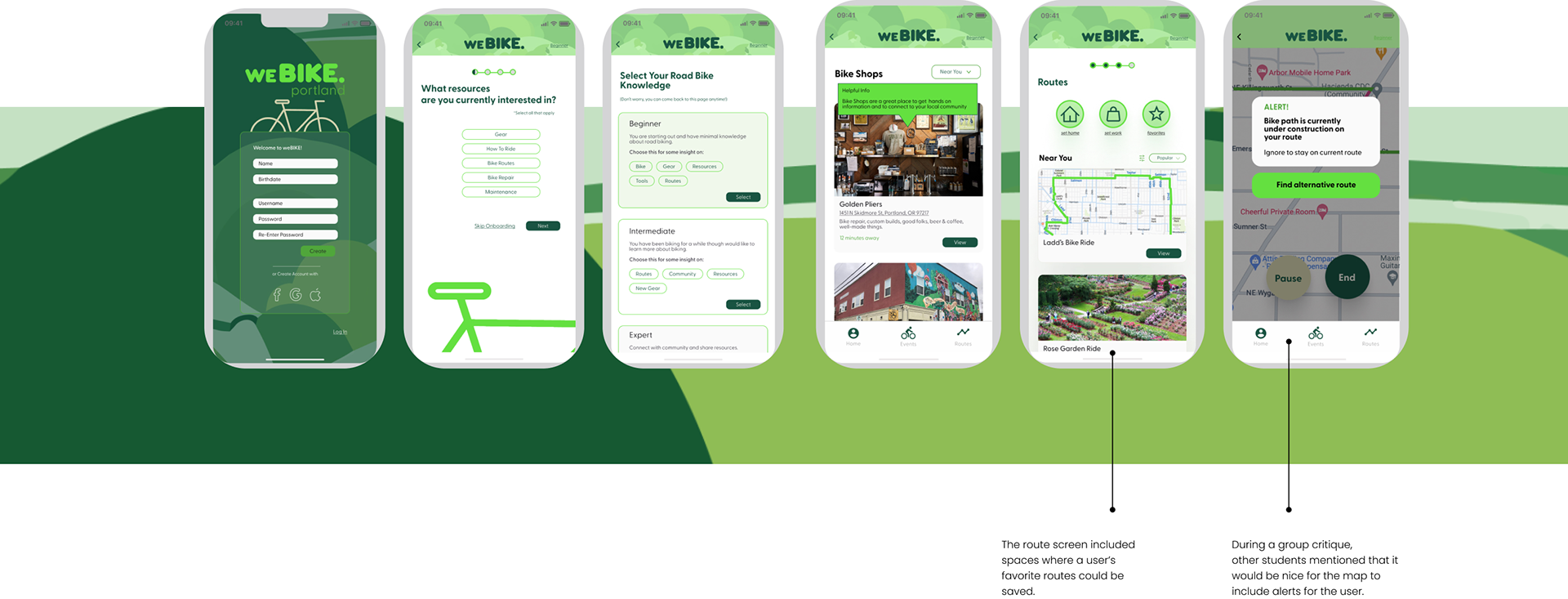
Revisions
Changes were implemented after testing was completed.
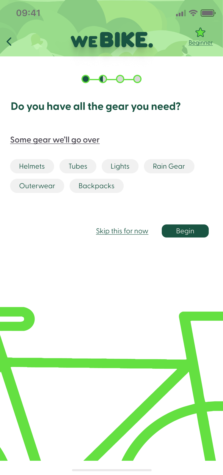
I added clarifying information into a couple of the Onboarding screens, to help users know what to expect next.
I updated the onboarding screens that asked about gear needed and if the user had a bike. The new screens featured examples of what would be asked on the following screens, so the user did not have to guess.
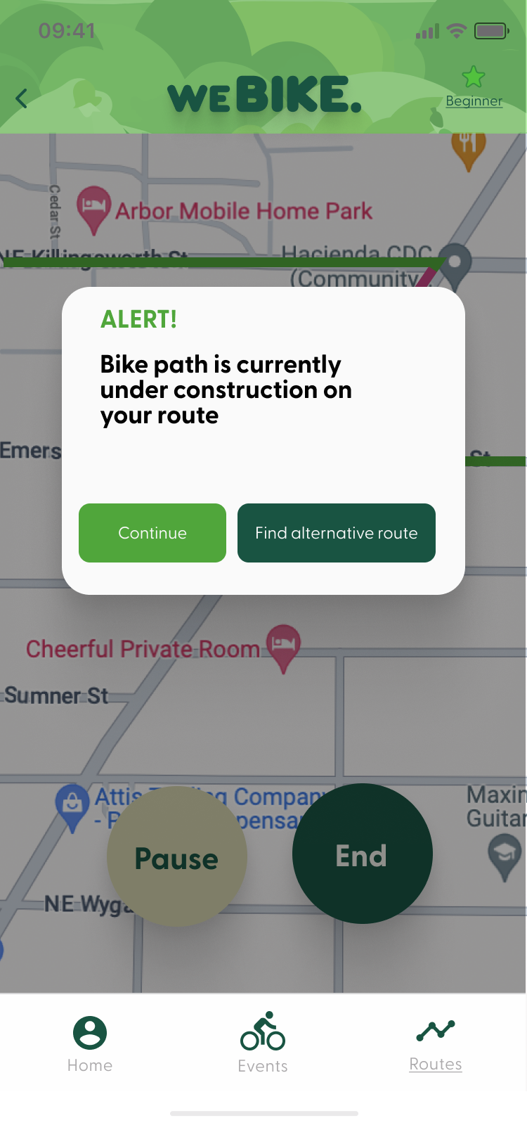
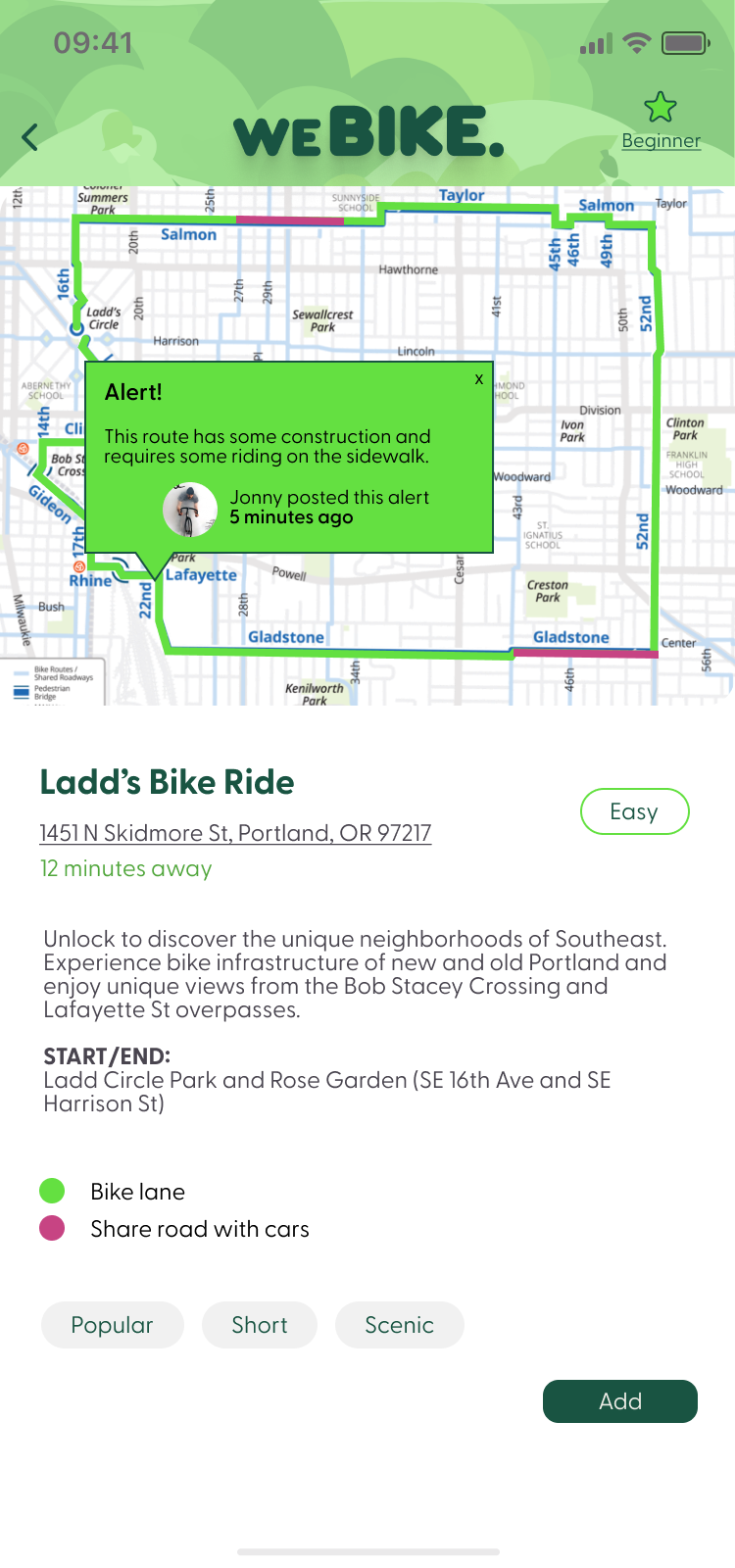
I re-arranged the alert screen and added a feature where users could see what alerts they would face before getting on their bike.
This would alleviate safety concerns that both users and I had.
In the end, I was left with a product that quickly informs new users about some key resources that will elevate their street riding experience. Helpful navigation and connection allows for intermediate to expert riders to explore the product as well.
Final Screens


Next Steps
Features for the future.
With an 80 hour limit, I was unable to add in all the features I would have liked. In future revisions, there would be a larger emphasis on promoting bike events and connecting with the community.
The product ended up focusing on resources for riding a bike, as the users I interviews struggled with this part of the process the most. I loved creating a space that has the potential to bring people together, as a community.