

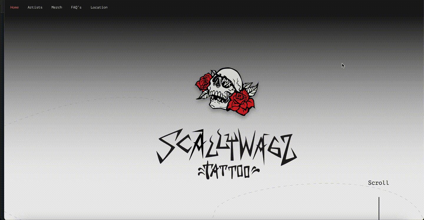
Scallywagz, A Tattoo Parlor / Responsive Website
Brand and website development for a Portland-local tattoo shop.
I worked with owners, Anna D + Mary Jane, to bring a website to life.
My Role:
Research, Personas, Task flows, Sketching, Wire-framing, Visual Design/Branding, Prototyping, User Testing
Team:
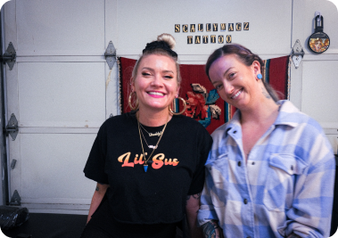
Scallywagz Crew, Group Critique Peers
I worked with owners, Anna D + Mary Jane, to bring a website to life.
My Role:
Research, Personas, Task flows, Sketching, Wire-framing, Visual Design/Branding, Prototyping, User Testing
Team:
Scallywagz Crew, Group Critique Peers
About
About Scallywagz
Scallywagz, a tattoo parlor in the heart of Portland, is expanding.
With the addition of new artists, owners Mary Jane and Anna D., decided they needed to update their booking systems.
Their need was a website that was informative and allowed each artist to book whatever way they wanted to.
Their need was a website that was informative and allowed each artist to book whatever way they wanted to.
The Challenge
Creating an easy to use platform that doesn't overwhelm the user, while guiding them to specific information and call-outs can be difficult, especially if new artists join the shop. The goal of booking can be overwhelmed by other features the owners wanted to include within the website. I also wanted to make sure that the website would be mobile-responsive, as most of their users booked through their phones.
Objectives
An easy-to-use and easy-to-view platform that informs the user of each artist and allows them to book a tattoo appointment with their chosen artist, easily.

Research
I first met with Anna D and Mary Jane to get an idea of what they were looking for.
They already had an idea for the website - "Make it look like bad-ass chick + Thrasher Mag."
I looked through some of the sketches they had for a logo and we went through a few different tattoo shops in the area, to see who had a website similar to what they were looking for.
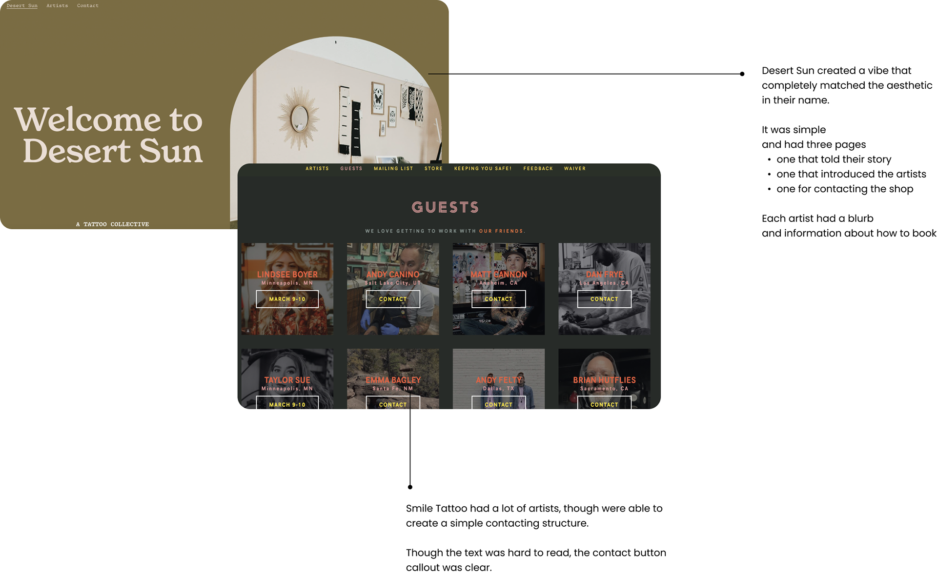
Competitive Analysis
There were a couple of shops that stood out.
Second Round of Interviews
We decided that we could make a very brand-heavy and simple to use website was do-able.
I decided to interview a few people
who had been tattooed in the past, some even by Scallywagz artists.
Some key takeaways included:
1. Users are going on the website to book or to get to know the artist
2. Make the booking process simple and easy to locate
3. Create a space for users to get to know the artist
4. Website feel is true to its brand, so users can decide if it feels safe / to their liking
5. This will help new users get to know artists and feel safe to book
6. Will keep folks coming back to the site (also, with tools like signing waivers online + uploading ID)

POV / HMW
Users are busy, though want to feel safe and comfortable with an artist and booking can be confusing.
How might we create a seamless booking experience for new users wanting to get a tattoo with our artists?
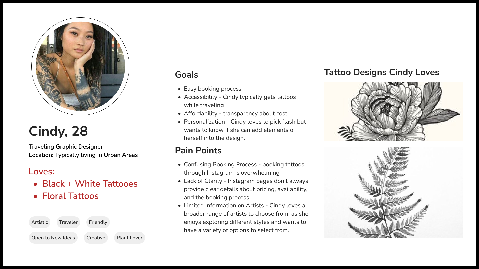
User Persona
Meet Cindy.
Cindy loves to get tattooed while traveling.
She wants to get to know her artist through a bio and loves a quick booking process.
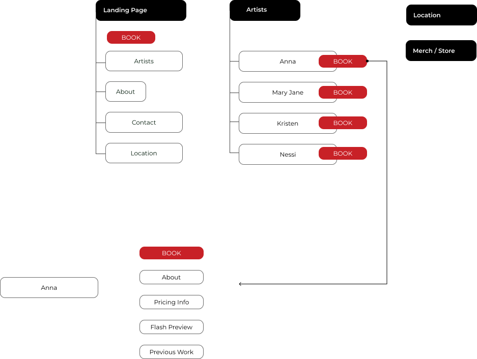
Site Map
I created a Site Map
To help highlight the features users were interested in seeing.
This also helped me decide where to place different booking CTA's.
Task + User Flows
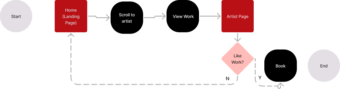
User Flows helped track my user's experience, which helped me better understand their next steps and find missing pieces / gaps. I wanted most of the features to be on the landing page, but still wanted to figure out if that was the most effective way to achieve a user's goals of booking and getting to know the artists at Scallywagz.

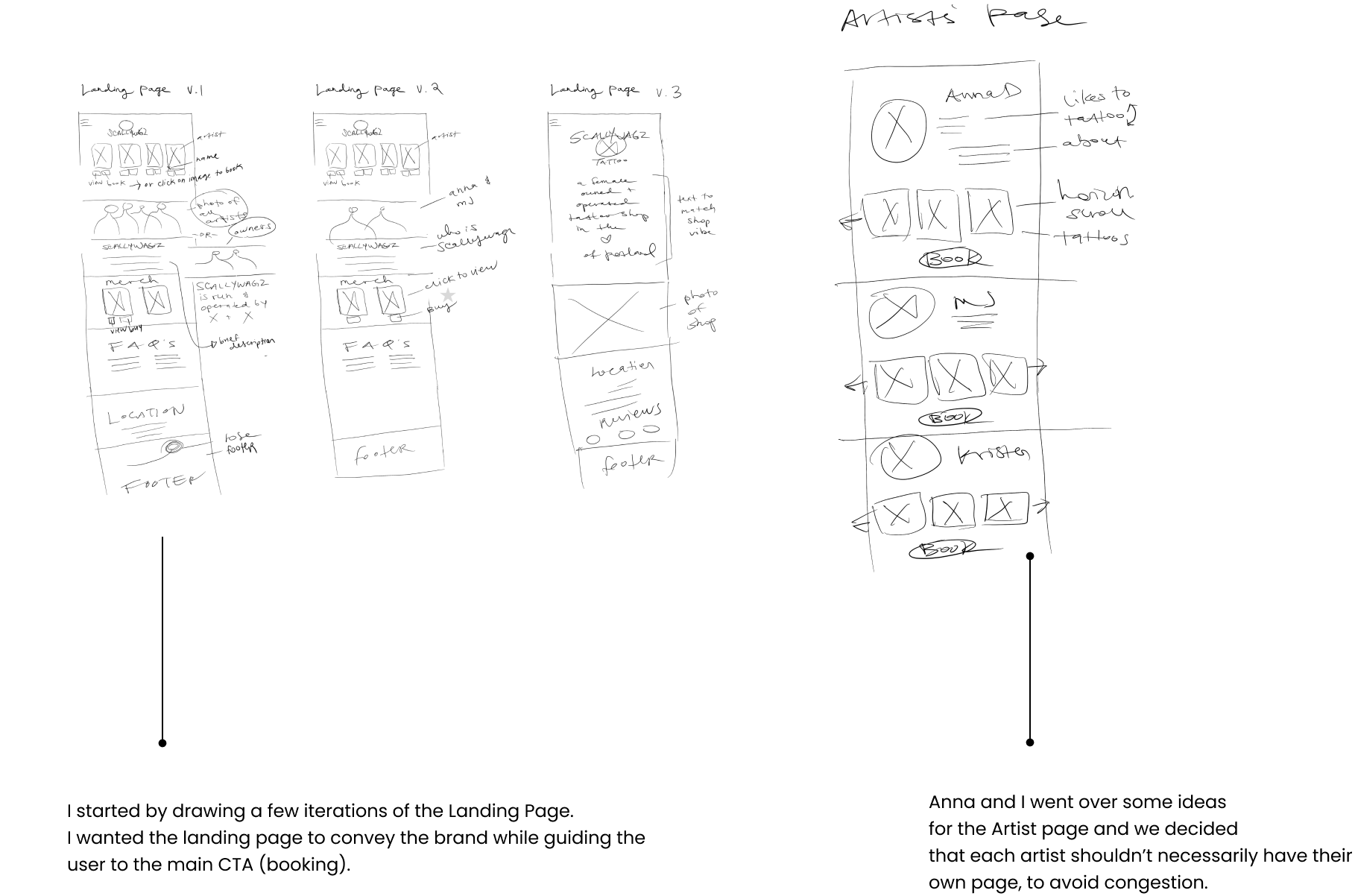
Iterations
Initial sketches helped map out how I wanted to lay the website features out. I wanted to make sure all the website features would work in a mobile-responsive setting as well.
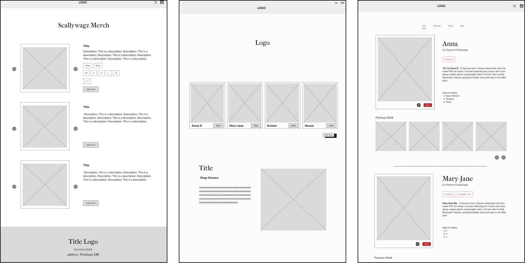
Fidelities
In Figma, I designed a few desktop screens to lay out the key frames.
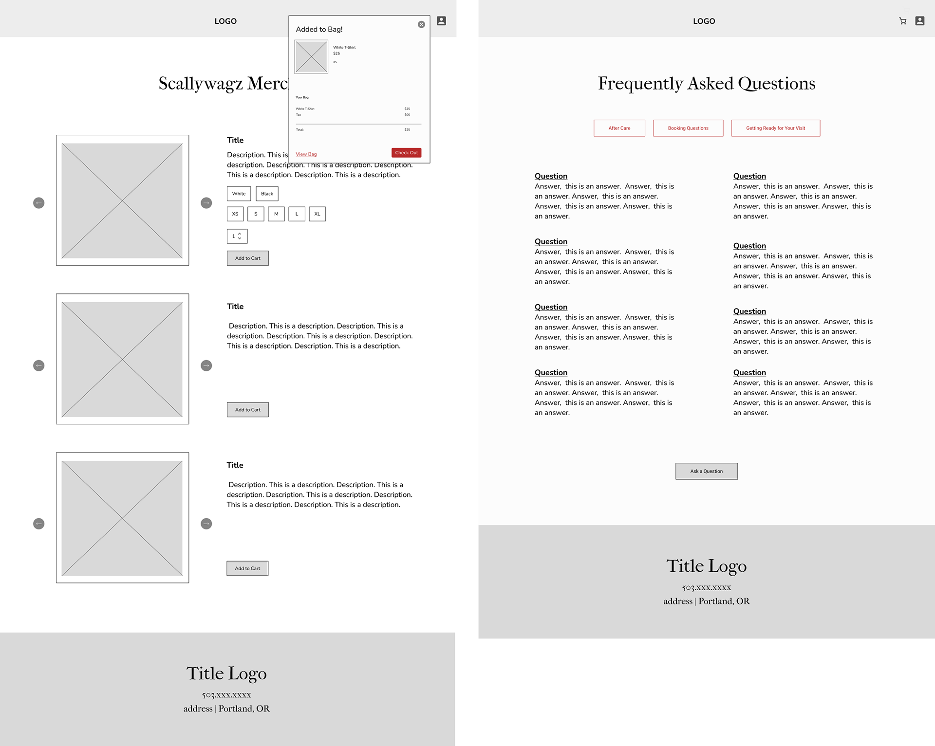
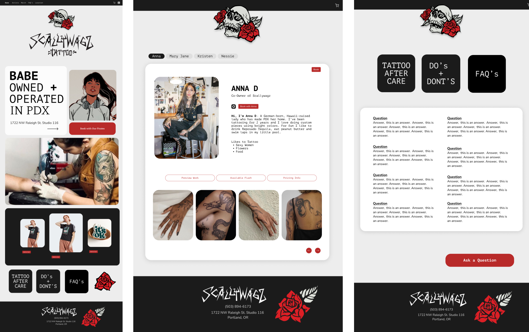
I included a landing page, artist pages, FAQ and merch. page.
My first iterations had all the artists on the landing page and a blurb about the shop owners, which I thought would help build rapport and understanding of the brand as a whole.
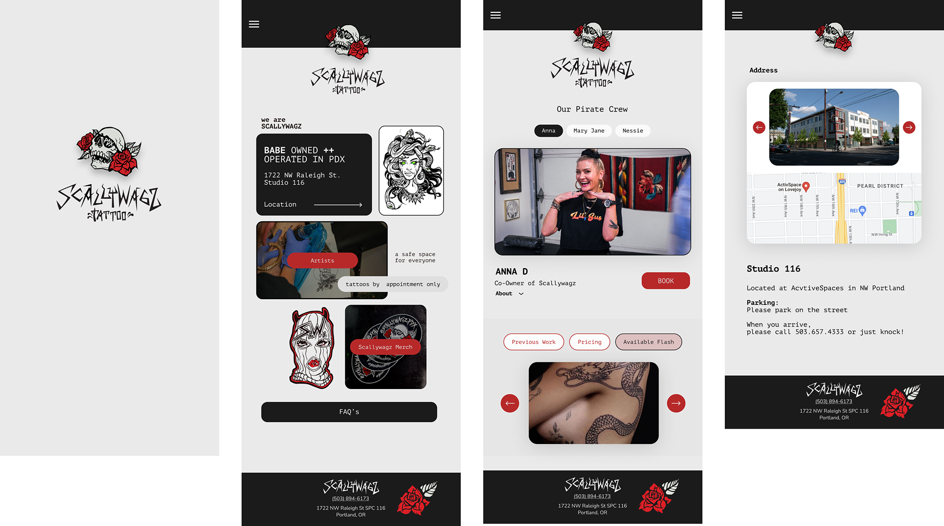
Mobile Responsive Mid-Fidelities
Mobile Responsive Mid-Fidelities were also created to allow for accessibility, no matter what screen the user had in front of them.

UI
Before moving onto higher fidelities, I decided to work on bringing the shop's vision to life.
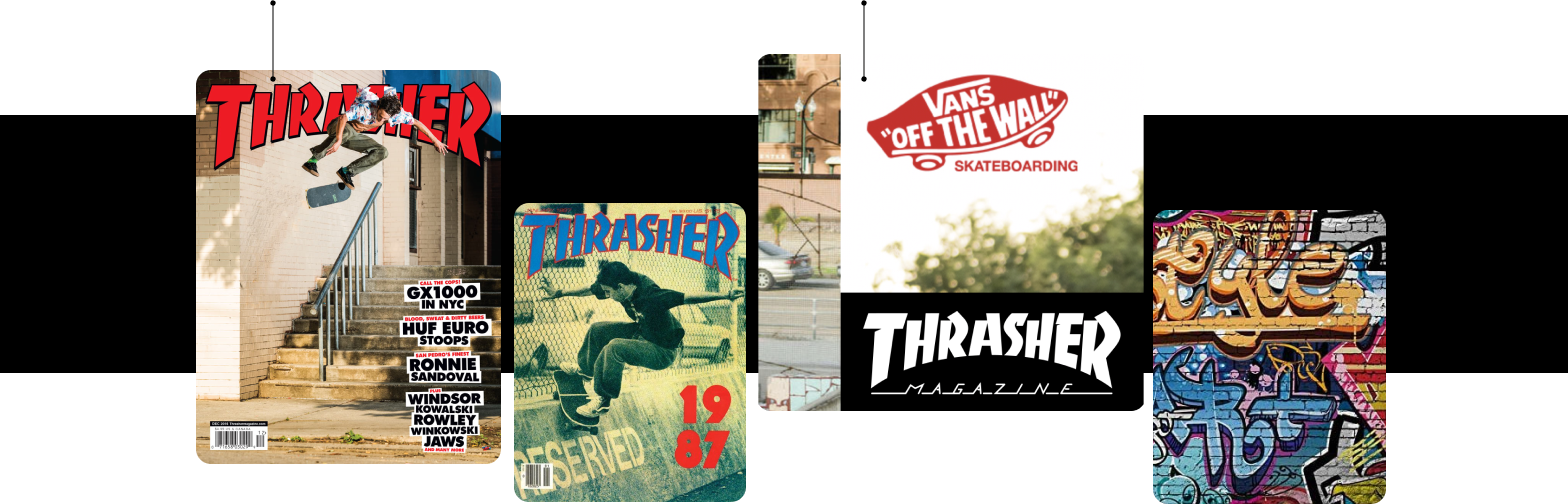
I created a mood board to help me visual the Thrasher/ Punk-rock vibe the owners wanted.
These magazines seemed to encapsulate the vision, the colors, the brand very well.
These magazines seemed to encapsulate the vision, the colors, the brand very well.
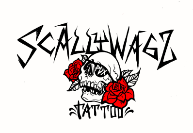
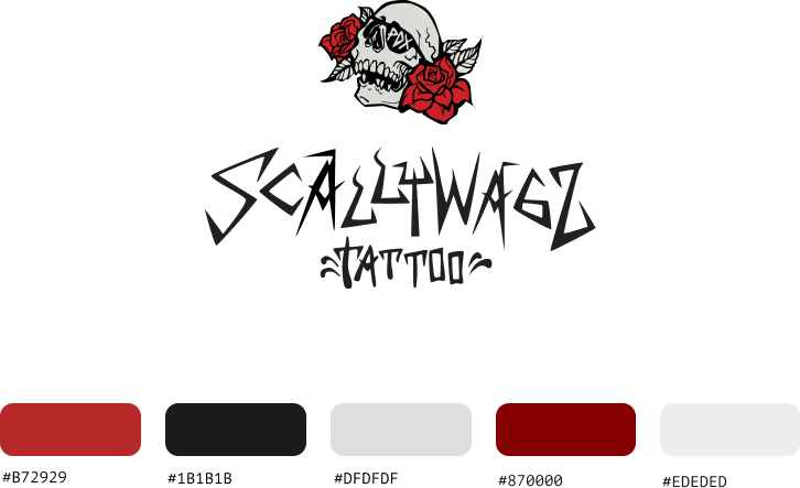
I converted Anna's logo sketch into a vector, using Illustrator.
Then, created other UI elements.
I created some components to use throughout the site and thought about some ways in which users would get their FAQ's answered.
I decided to go with a red and black theme and converted other drawings into elements that could be used in the design.
High Fidelities
I began putting all the pieces together, while keeping Anna + Mary Jane's hopes for a Thrasher-like webiste.
The landing page would contain an art-ful array of links, with different hover states. The action buttons were red, to help draw the user's eye.
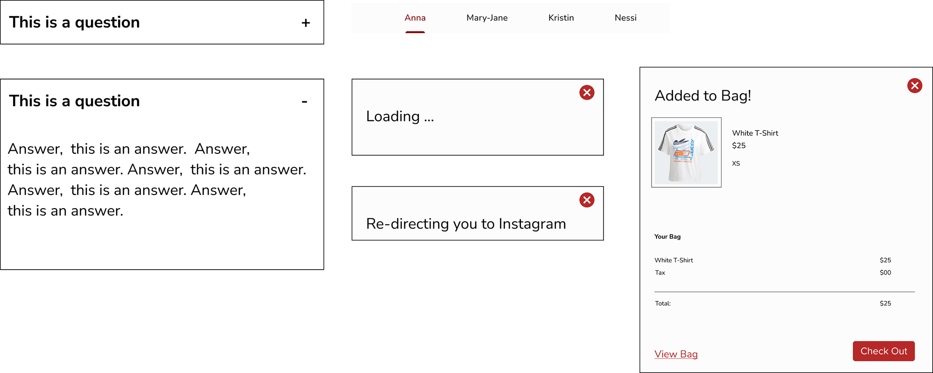
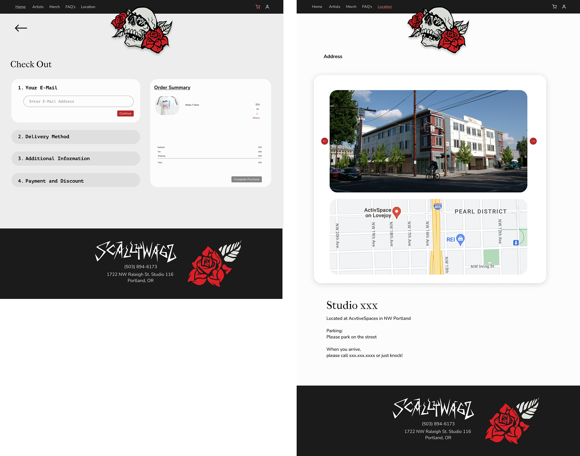
An artist page and FAQ page were additions the owners wanted to see, as well, which included options for clicking through and seeing all the artists working in the shop.
Usability Testing
Test Objectives
1. Test the navigation
2. Test ease of use
3. Test user’s ability to complete task
4. Discover any potential pain points or difficulties for users to complete tasks
2. Test ease of use
3. Test user’s ability to complete task
4. Discover any potential pain points or difficulties for users to complete tasks
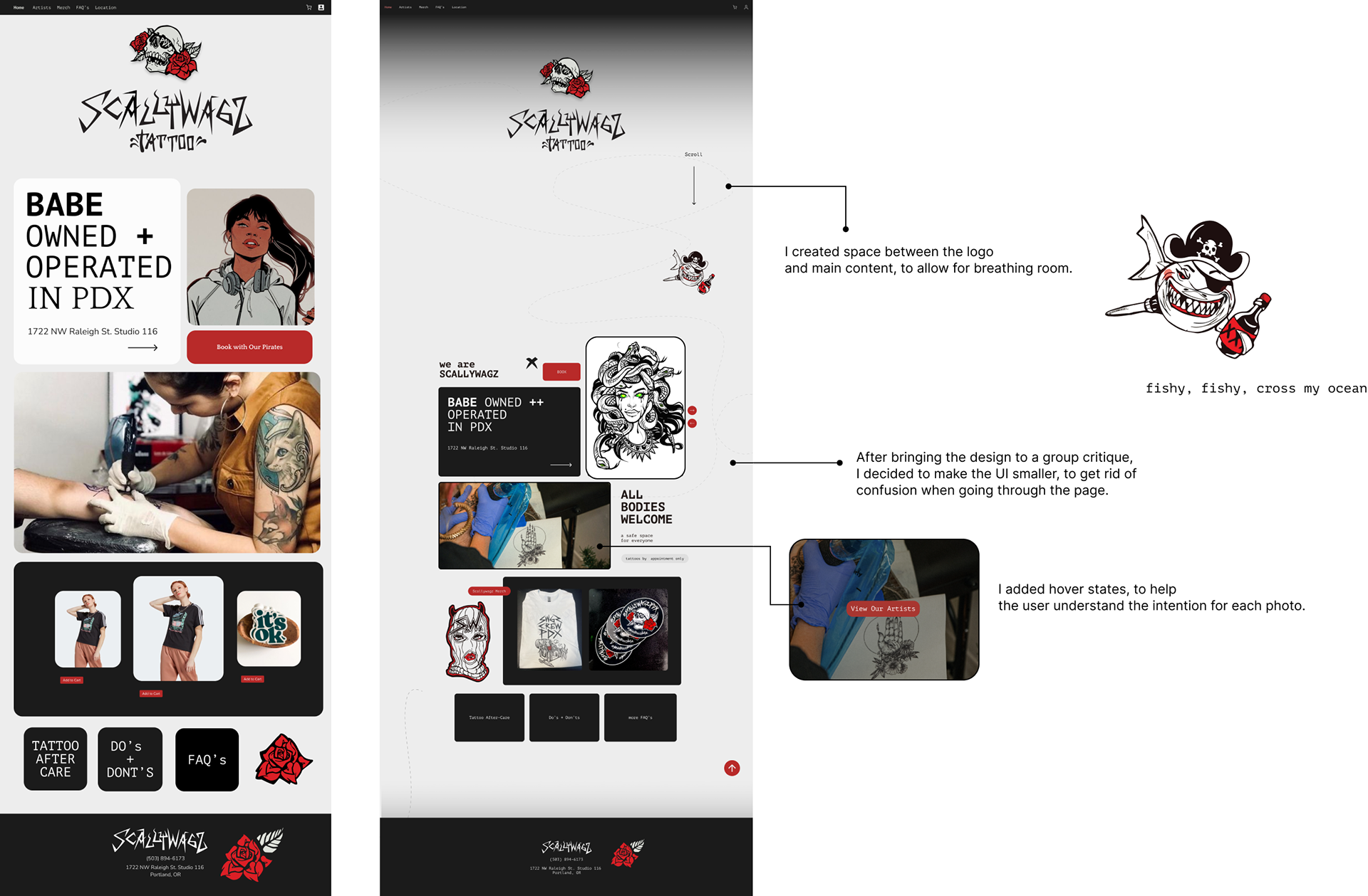
Users found that the interface was just too big, which created confusion. Buttons took up too much space and the images took a while to scroll through.
Users were able to use navigation and understood where they were going, even after feeling overwhelmed.
Revisions
I made a few revisions after usability testing.
I updated the landing page, making the elements smaller and added some fun movement.
The cards were updated to reflect artwork that was made at the shop and I updated their merch section.
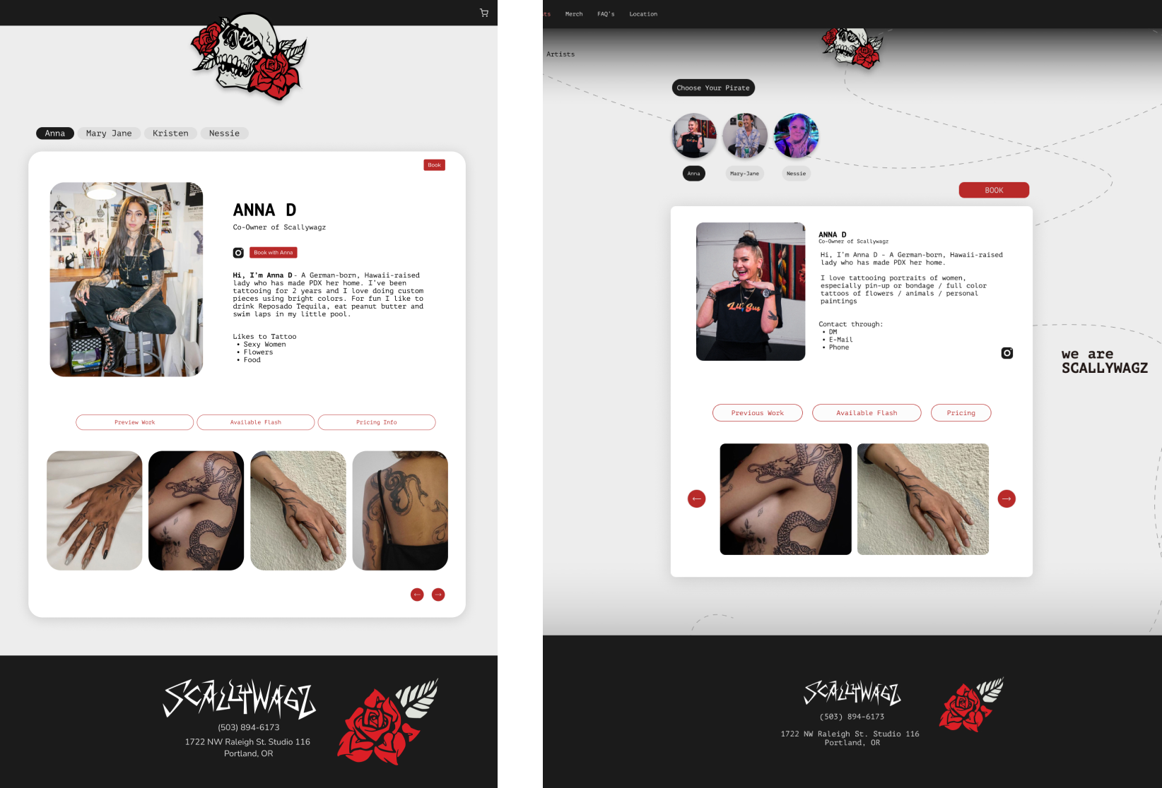
The artist page seemed to be confusing to users during testing as well.
"It feels that Anna is the only artist featured. I didn't really know there were other artists to click through.
After talking with my mentor, I decided to add photos to the artist navigation bar. I made the card smaller, as users thought everything was too large and there was too much to look at.
I simplified some of the UI elements
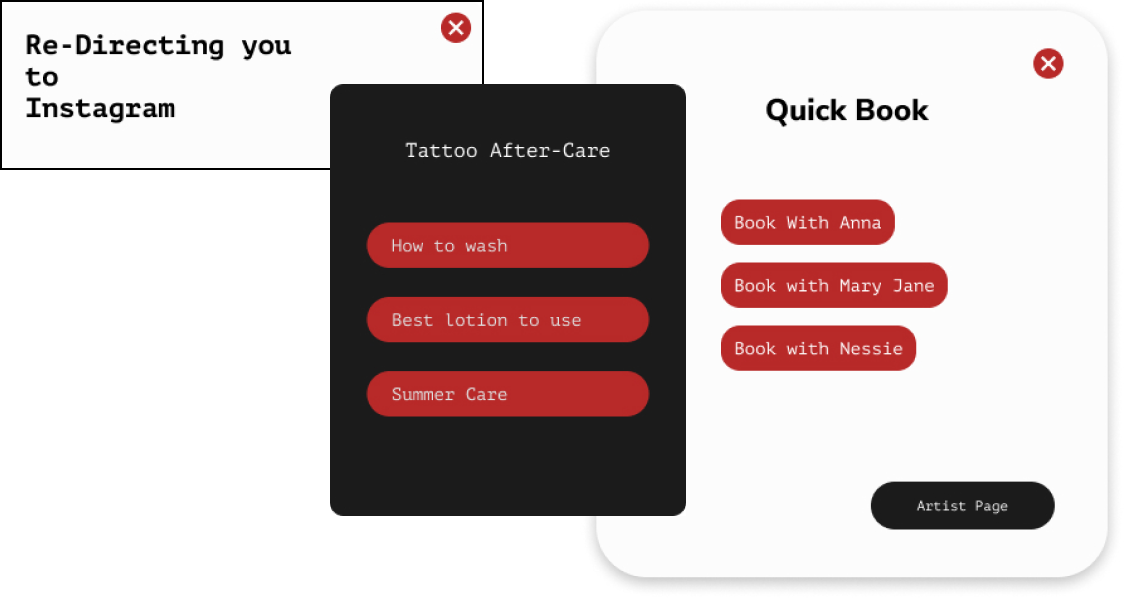
I created a 'quick book' option, so that users could book from the home page.
Mobile Responsive
I made sure my mobile-responsive versions were updated as well, to reflect any changes.
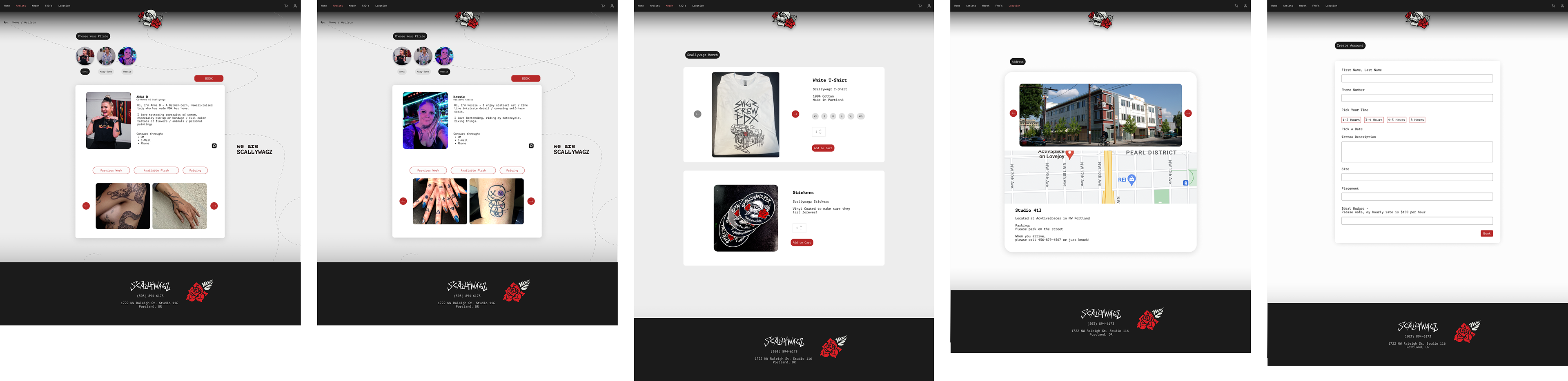
Final Product

Next Steps
Features for the Future
Taking time to do a photography session are in the next steps to finalize this website, which would help create a more cohesive look. I am currently working on this with Scallywagz.
The process of creating a website for an already existed business was a fun challenge and allowed me to figure out solutions to real issues Scallywagz was facing.
I look forward to the next steps and to getting their website up and running!
Prototype
